(Assuming a new RA logo is something the community really wants), I think we're starting to get too hung up on ways to modify the Rust logo to get a RA logo. Consider the Cargo logo: a bunch of cardboard boxes on a shipping pallet (arguably those boxes should have been crates?). The Rust logo is barely noticeable in the logo. The Cargo logo stands on its own, suggesting cargo, crates, shipping, manifests — all real things that that Cargo is/does.
I think the RA logo should go down the same path: taking some novel concept that describes what RA does without reference to Rust itself, and then figuring out where we can place the Rust logo in this design.
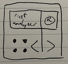
(All this assuming we want a new logo at all; I'm 50-50 on whether the current RA logo needs sprucing up. The r.a in a square looks pretty nice.)
Here's an idea I just came up with. I like the idea of having a turbofish in the logo — I think at this point it's emblematic of the concept of Rust code.
Personally it's not getting hung up, I wouldn't like Rust Analyzer to have a freely designed logo personally, hence the adaption of the original logo. Rust Analyzer would be representative in the VSCode Marketplace for the language itself, so I think it should stick as close as possible to the original logo to make it easily recognizable.
Because within the Marketplace it's not just an additional component to the language, as it basically is, but actually "Rust for VSCode" (although it's not named like that still) itself: https://i.ibb.co/yFfSYMB/2022-11-22-18-13-09-Window.png
I like the goals here, to be fair:
NOTE: I would go further and say it would be better to rename Rust Analyzer and only use this name as an internal component name to not confuse people. The logo of it and naming should be consistent with Rust itself, as in "Rust for VSCode", "Rust Language", "rust-lang", etc.
Here is a quick (very crude!) sketch of this idea in SVG format, if anyone would like to play around with it.
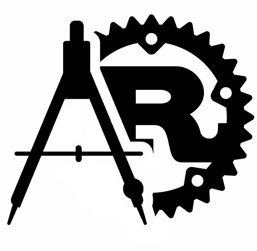
Following the idea that good logos often represent the functional purpose of a product (like cargo as described by bert), maybe RA's logo should combine the rust logo with some sense of "analysis".
Perhaps stealing imagery from metrology (images, guide), like these that I threw together:
I'm partial to the second one, personally.
I like the second one but I would put the compass on the right side so we can read it as R(ust) A(nalyser).
Suggestion: when posting images, include a very small favicon-sized (16x16, maybe 32x32 if you only care about high-dpi) version. Some ideas posted so far don't have favicon-friendly versions.
First variants is amazing, I very like it. Please, notify if some poll will be started
So, I think, we should summarize.
Moving on with the VARIANT 4.a for smaller use cases, and VARIANT 4.b for larger use cases. But now the new trademark policy will definitely want me to strip the "R" out of it. I'll iterate over and submit directly to the RUST RFCs (rust-lang.github.io).
Thanks everyone for guiding.
Rust Analyzer is part of the Rust Project so will almost certainly be able to acquire a license for a new logo from the Foundation if necessary. (The policy only sets out terms under which you can use the logo without asking the Foundation about it, it doesn't limit what the Foundation can additionally grant).
my two cents:
#1 basic and nice and great #2 quite pretty, agree what @2e71828 said about the messaging wrong #3 NO #4 no #5 looks good, could try some more fonts too, looks a bit off center
This topic was automatically closed 90 days after the last reply. New replies are no longer allowed.


