Is there any particular reason why the logo on github is so dark? I've always thought that looked a bit weird, it's kind of tough to identify when smaller until you look close

I had to put together a slide for something with a bunch of language logos (official and unoffical) at some point, here it is for reference. It's obvious that they are all designed with care. Though Ada still somehow has that DOD look.

"how does it look great at tiny sizes" is always an important question, though that's not to say that the tiny and large logos have to be the same. We see the tiny rust logo all the time (I don't think the dark one makes a great favicon).
![]()
Do logos matter? Branding 100% does, and logos are a part of branding. Look at the java collections page and the kotlin collections page. Even as engineers used to reading technical documentation, it's impossible not to be swayed by the latter's far superior graphical design, all things considered.
Opinionated part:
Does the logo need to change? No, definitely not, I don't think it looks old at all and it does a great job representing Rust. I don't think there's any sense at all in making a drastic change, especially not to Ferris (as was briefly mentioned earlier).
Could it change? Sure, it could be cleaned up slightly. I'm a big fan of @Aloso's suggestion and think it should be adopted at least for favicons and other small size usage. More important than just updating the logo are things like the following:
- Preferred colors for the logo itself, when on light and dark backgrounds
- Tri/tetracolor or full color option if allowed (dark wheel with a gradient red-orange R could look cool). There is a definite need for a "bright" version of the logo.
- Preferred background colors for when needed
- Pantone colors for shirts & other merch
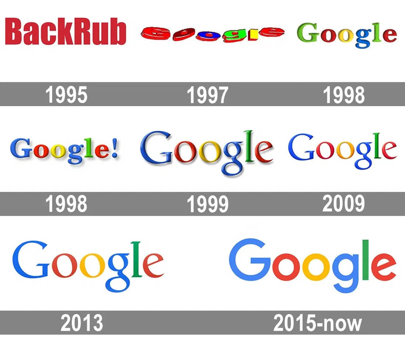
- A version of the logo with text "Rust", "Rust Language" (e.g. python, even though their text is in terrible need of some modernization. They're stuck at 1999 Google)
- Maybe a "Powered by Rust" logo like Python's "Python Powered". Imho this might be the best thing for getting the language out there - I find them kind of cheesy, but I'd still totally pick a "Rust Powered" product over something else that's similar
All of this and could pretty easily go into a Rust language "graphical style guide" with minimal effort.
Will any of this grow Rust's popularity? The logo alone probably not much, but it's a definite yes for all of the branding together. Does any of this matter more than things like language functionality or documentation completeness? No, definitely not. But the group of people patching IR generation in the compiler doesn't need to overlap much with the people picking out complementary colors, everyone has their niche. It takes a village.
Side note: Even though I don't find it a great "logo", moment of appreciation for how creative the graphic design for the cargo representation is. Box in Cargo, loaded with cranelift, shipped in crates, and registered by a manifest... I love the thinking of whoever stuck with the shipping analogy.
