Feedback on new rust documentation logo background

You can test it here: https://doc.rust-lang.org/nightly/std/

Providing two versions of a logo seems too much for me. For now we only have 3 themes, but what happens if we had a fourth one which ends up with the same result? Do we have to suddenly ask for a third version of the logo? I feel strongly against it. :slight_smile:

1 Like

In next nightly, currently one doesn't have new CSS rules.

I think I'm missing something. I disabled dark-reader to be sure, but it feels that the logo doesn't have the light shadow:

Dark theme:

image

Ayu theme:

image

Light theme:

image

No, there should only ever be "light" and "dark" themes. Right now there are 2 dark themes and 1 light theme. A future hypothetical fourth theme should fall in either the "light" or "dark" categories.

And before you mention hypothetical colored themes: I don't think a theme's hue should be user-selectable. It should be selected at build time (in which case the crate author knows which color(s) to use/not use). The user should only be able to toggle between light/dark modes.

1 Like

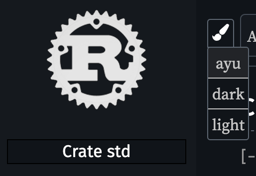
This seems like the most straightforward solution to me, and I think it ends up looking pretty nice for at least the Rust logo:

rustlogo

5 Likes

You don't take into account the fact that you can add your own theme. Also, it's pretty common to redshift themes or some other ones that makes the reading experience and that don't go into "dark" or "light" themes categories.

@bascule Same answer as this replies thread. :slight_smile:

Let's avoid hypotheticals: can you show a realistic example where light/dark logo variants wouldn't solve the problem?

I can ask the same: can you show an example where the current fix doesn't solve the problem? :stuck_out_tongue:

In the current case, it requires one line of CSS. In your case, it requires to generate multiple version of your logo (I'm pretty sure docs.rs people will really love this idea haha, cc @jyn514).

The drop shadow does solve the problem. I'm not saying it doesn't. I just don't think it's an ideal solution. It doesn't look as good/clean as having separate light/dark logos.

I see. Well, I really have a problem with having multiple logos for multiple reasons. I was mostly hoping that someone came up with a magical CSS add which would solve all issues. :3

If you don't mind absolutely destroying logos which aren't flat black/white, there's filter: invert(100%) :sweat_smile:

(Actually, it might be a solution to invert the light mode logo for dark mode if one isn't present, but also allow a dark mode logo to be provided for logos where that is bad (or for color logos that work on both to opt out).)

1 Like

IMHO, the drop shadow looks, to put it bluntly, quite bad. It doesn't fit in at all with the rest of RustDoc's design, which is very flat and doesn't use any dimensional design elements (such as drop shadows) anywhere else. It's pretty jarring.

As a crate maintainer, I would much rather provide multiple versions of my crate's logo for light and dark themes. I don't think that this would necessitate providing more variants as multiple themes are added — all the themes can basically be binned into "light background" and "dark background", and we can choose which logo to use based on that. If the logo looks equally good on light and dark backgrounds, the crate can just provide the same image twice. I'd much prefer this over having the drop shadow inflicted on my crates' logos.

In general, I think any solution that's based on RustDoc automatically adding something to the logo runs the risk of not looking nice with all logo designs. With that said, if having to provide multiple versions of the logo is deemed unnecessary, I think it would be much better to use a light-colored stroke or border around the logo, rather than a drop shadow — it would fit in much better with the rest of RustDoc's design language.

14 Likes

I agree on most of what you said. Adding a border and a background color might do the trick I guess!

I get the same exact issue.

That's what I did here: Feedback on new rust documentation logo background - #9 by bascule

I think if it were a declarative option/attribute you could set on a logo, this would work great for a lot of black/white logos.

If a logo has colors, it seems like it would be less affected by the background changes, so I think making it opt-in is a good option for black/white logos.

1 Like

The PR was merged today so we have to wait for the nightly docs to be regenerated. Please try again tomorrow. :slight_smile:

2 Likes

That was my first attempt to solve the issue, but as you say, it can be awful on colorful images. The drop shadow seemed to me the most easy and general fix.

I have not found a way to do a solid outline with a simple CSS rule, that might be better, if anyone now how to do that.

Solid outline can be faked with 4 or 8 sharp shadows offset by 1 pixel.

There's also a trick:

filter: invert(1) hue-rotate(180deg);

that preserves colors while inverting brightness. Some logos will still look strange, but not as much.

    filter: drop-shadow(1px 0 0px #fff)
        drop-shadow(0 1px 0 #fff)
        drop-shadow(-1px 0 0 #fff)
        drop-shadow(0 -1px 0 #fff);

looks like this:

Screen Shot 2020-07-24 at 4.49.07 PM

1 Like