I'd like to know if a little update to RustDoc's non-JSON output is possible, without much effort, but just to approximate more to a noticeable visual difference, without changing the layout structure.
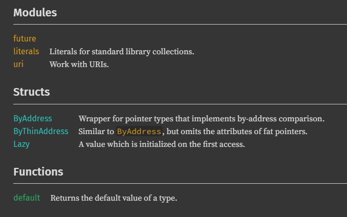
I want a visual difference to make not only colors more neutral, but also to hide certain ugly aspects of crates; for example, I'd like not to see the name of the aliased crates in this case and just an anchor link instead:
I strongly disagree after taking a look at the two pages you linked. Due to their lack of using colour to code information about what I'm looking at it is harder to find things.
API docs are first and foremost about being as usable as possible, not about winning hypothetical beauty contests.
They need to be fast (which all three alternatives seem to be), no sluggish pages.
They need to present information such that the user can quickly find what they want: Syntax highlighting with colours help here. Humans are better at picking up colours than shapes in a collection of "things". Using consistent colours for things like traits across the docs (both in code and in listings) help establish patterns and expectations in the brain of the user.
Now, it is possible the colours can be improved: are they optimal for common types of colour blindness? I don't know (I'm not colour blind myself and don't know much about it except that red/green is the most common (but far from only) one). And there might be other accessibility concerns in the design that I'm unaware of.
But "beauty" is highly subject and very far down the list of priorities.
What would you define as "professional?" It seems like you prefer more of a passive color palette. You can certainly suggest a new theme to be added like the "Ayu" one, but don't change the default for everyone based on your opinion.
Rustdoc may not look "professional", whatever that means, but in exchange it's readable, unlike javadocs. I'd consider that an upside. Professionalism should be what works best, after all.
Yes, javadocs are technically readable. It does however take significantly longer to visually parse them. When I'm going through docs trying to find something, the last thing I want is to have to spend more time just dealing with the site's theme.
On a more productive note:
definitely don't hide the names of aliased crates. Those are semantically meaningful: if you want to use the crate through the reexport you will have to do so via the aliased name. Hiding them makes about as much sense as hiding function names.
keep the colors. They help greatly in visually parsing a list. If you want a theme that supprsesses them be my guest, but no replacing the default
Layout changes are where the biggest improvements would be made. Adopting the method summary table from Javadoc or the split sidebar from MDN would have a much bigger impact on how easy to use Rustdoc is than the color scheme. "It's not just what it looks like and feels like. Design is how it works."
Convincingly arguing for a UI change is going to be the hardest part of making it happen, not the implementation work. If you want to change Rustdoc's UI, you're going to need to convince most of the team that it's a good idea, and that's going to be about equally difficult whether it's swapping out a single color to completely rearranging the sidebar, so you might as well rearrange the sidebar.